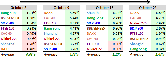
All eight indexes on our world watch list posted gains over the past week, with central bank policy as a key driver. On Thursday the ECB's president hinted at another stimulus package, and on Friday the Chinese central bank cut interest rates for the sixth time in 12 months. The two Eurozone indexes were the week's biggest winners, the DAX up 6.83% and the CAC 40 up 4.70%. The Nikkei finished in third place with a 2.92% advance and the S&P 500 finished fourth with a 2.07% gain.
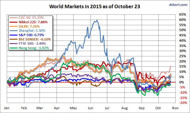
Here is an overlay of the eight for a sense of their comparative performance so far in 2015.
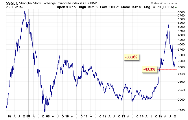
As for the Shanghai Composite, below is a log-scale weekly chart illustrating the bubble that peaked in 2007 and the bubble that started last year. The index is now down -33.9% from its June 12 peak but well off its -43.3% interim low set on July 8th. Optimists might identify the interim low as the beginning of a new bull market. But a comparison with the failed rallies during the crash that began in 2007 suggests a less encouraging forecast.
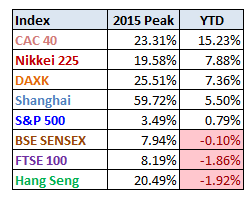
Here is a table of the 2015 data performance, sorted from high to low, along with the interim highs for the eight indexes. Three of the eight are in the red YTD, down from four last week, with the S&P 500 moving back into the green after 45 trading days in the red.
A Closer Look at the Last Four Weeks
The tables below provide a concise overview of performance comparisons over the past four weeks (through year's end) for these eight major indexes. We've also included the average for each week so that we can evaluate the performance of a specific index relative to the overall mean and better understand weekly volatility. The colors for each index name help us visualize the comparative performance over time.
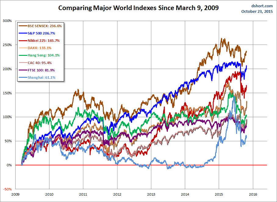
The chart below illustrates the comparative performance of World Markets since March 9, 2009. The start date is arbitrary: The S&P 500, CAC 40 and BSE SENSEX hit their lows on March 9th, the Nikkei 225 on March 10th, the DAX on March 6th, the FTSE on March 3rd, the Shanghai Composite on November 4, 2008, and the Hang Seng even earlier on October 27, 2008. However, by aligning on the same day and measuring the percent change, we get a better sense of the relative performance than if we align the lows.
A Longer Look Back
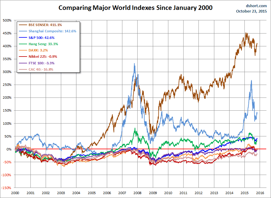
Here is the same chart starting from the turn of 21st century. The relative over-performance of the emerging markets (Shanghai, Mumbai SENSEX and Hang Seng) up to their 2007 peaks is evident, and the SENSEX remains by far the top performer. The Shanghai, in contrast, formed a perfect Eiffel Tower from late 2006 to late 2009.
Check back next week for a new update.
Note: We track Germany's DAXK a price-only index, instead of the more familiar DAX index (which includes dividends), for consistency with the other indexes, which do not include dividends.
All the indexes are calculated in their local currencies.

