The ever-increasing cost of homes obviously causes a lot of people a lot of angst. Chief among those groups, naturally, are the people who are planning to buy a home but do not yet have one; and, since higher home prices are very highly correlated with higher rents, renters too are alarmed that the rent is too damn high! (if that reference eludes you, educate yourself at this link)
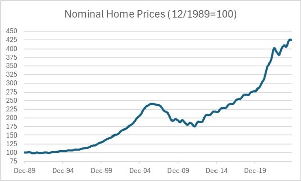
Right behind the people who have to actually buy homes and rent apartments, though, are the economists who seem to be perennially alarmed that home prices are “in a bubble” again. Certainly, if you look at nominal home prices (represented here by the S&P Case Shiller U.S. National Home Price Index, normalized like all of the charts in this article so that December 31, 1989 = 100 and the latest figure is for the end of September 2024) then you can see the cause for concern. Home prices are up 75% since the peak of the home price bubble of the late 2000s! If a house at $241,000 was in a bubble in 2006 (and subsequently declined in price to 175k), then surely it’s in a bubble if it’s now at $425k?
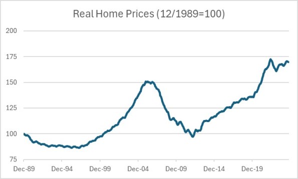
You can see in this chart the rapid acceleration in 2021-2022, and that se hould be a clue about one of the things that is going on with homprices. The overall price level is a lot higher than it was in 2006; the dollar simply doesn’t go as far as it did back then. Indeed I’ve chronicled how, thanks to the supercharged increase in the money supply, consumer prices are up 23% since just before COVID. Obviously, then, we have to adjust the dollar price of a home for the change in the measuring stick (the dollar) itself. Here are real home prices.
This still looks like a bubble, if real home prices are 13% higher than the bubble peak. After all, homes are unproductive real assets. Over a long period of time, home prices have risen less than 0.5% per year after inflation. In this way a home is like a lump of gold. Ten years from now, the lump of gold is still a lump of gold and so you would expect the real return to be roughly zero (you have the same amount of stuff at the end that you started with). In the case of home prices, there is deterioration of the housing stock over time but also new construction and homes have historically gotten larger and more comfortable, so some small drift higher in real prices makes sense. But home prices since 1989 are up 70% in real terms, when they should be up roughly 25 * 0.5% = 12.5%. And since the 2006 peak, we’d expect 9% (18 years x 0.5%) would represent a similar peak. We’ve risen more than that!
So, definitely a bubble, right? That deflation everyone keeps promising us is imminent, along with the collapse of banks and all the other stuff? Not so fast; there is one other important thing to consider and that is household formation. Or, rather, household formation compared to housing-unit formation.
We start by imagining what could plausibly push real home prices above or below a long-run flattish trend, that would represent a legitimate effect and not a bubble. What immediately comes to mind for me is the fact that for at least the last few years we have seen a massive increase in the US in the number of heads over which we need to put roofs. Something in the ballpark of 10 million new residents need roofs, and we surely have not constructed that many new roofs. For a long time, I’ve been highlighting this as one really good reason to not expect rental or home price deflation: the demand relative to the supply is out of whack. However, it turns out that we don’t actually need to rely on the ‘unofficial’ increase in the population to conclude that the “bubble” isn’t so bubbly.
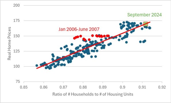
The chart below, covering 2004 to the present, shows the real home price (the second chart above) on the y-axis. On the x-axis, I have a ratio of the number of households in the United States (source: US Census Bureau) divided by the total number of housing units in the country (source: US Census Bureau). As the ratio moves higher, it means there are more households for every housing unit or alternatively, fewer vacant units. I only have the housing unit data back to 2004, as that’s what was on Bloomberg.
There is a pretty clear relationship here between real home prices, and the occupation ratio. I have highlighted two areas. One, in red, is the January 2006 through June 2007 period – sort of the teeth of the housing bubble. Those points are well above the line, suggesting that prices were high relative to the occupation ratio. In fact, January 2007 is the point that is the highest above the regression line. On the other hand, we have the most-recent point in green. This is right on the regression line. Yes, real home prices have gone up a lot. But that’s mostly because the construction rate of new housing units has not kept up with household formation.
As an aside, the three points at (0.91, 130) or so are from mid-2020, when there was a surge of household formation but home prices (and rents) were being constrained by the lockdowns. In retrospect, it was a great time to buy a house!
Note that the charts above do not include undocumented residents in the US, except inasmuch as the Census Bureau is including them. Since the total increase in households since January 2021 is only about 6mm…and for the prior 4 years, the increase was 5mm…I am fairly confident that the recent surge in illegal immigration is not reflected on this chart. Ergo, you could make the case that home prices are too low in real terms. If every 5 illegals form one household, the ratio would rise from 0.912 to 0.926, and we would be off the chart to the right-hand side.
Now, this does not mean that real home prices will not decline. In fact, I am very confident that at some point they will, as building catches up with household formation. That does not mean that home prices will fall in nominal terms, however; I suspect that what is more likely to happen is that over a number of years, home prices will drift sideways to slightly higher while overall consumer prices continue to rise. But, if 10 million illegal immigrants are deported, the building of new units will catch up a lot more quickly and nominal prices and rents could decline in that case.
If that happened, rents really would be ‘too damn high’. And that is one very big reason that mass deportation is not inflationary. It also is not very likely; I have the over/under at 1mm deportations.


