The Fed is raising rates in hopes of taming inflation by reducing demand. When the Fed eventually reverses course and begins to lower rates, it will be accompanied by a weak economy (probably a recession). Historically, the stock market doesn’t bottom until the Fed is near the end of its easing cycle and the recession is in its later innings. This suggests that the ultimate bottom in the stock market is many months away.
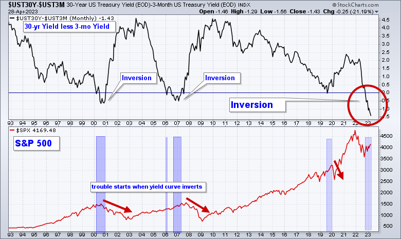
One historically accurate signal in predicting recessions is a yield curve inversion (see chart below). An inversion means short-term rates are higher than longer-term rates. This does not happen often but when it does the odds of a recession are high.
Below is a chart of the difference between the 30-year yield less the 3-month yield in the top panel. When the line drops below zero (horizontal blue line) yields are inverted. Look at the far right of the chart. The yield is substantially inverted (red circle).
In the lower panel is the S&P 500 and I have highlighted the last three major inversions. In each case, a recession has followed and the stock market has fallen between 33% – 56%.
Conclusion:
- Historically, the stock market bottoms when the Fed is near the end of its easing cycle and the recession is in its later innings. Given that the Fed is still raising rates would suggest that the stock market is many months from reaching its bear market low.
S&P 500 Index
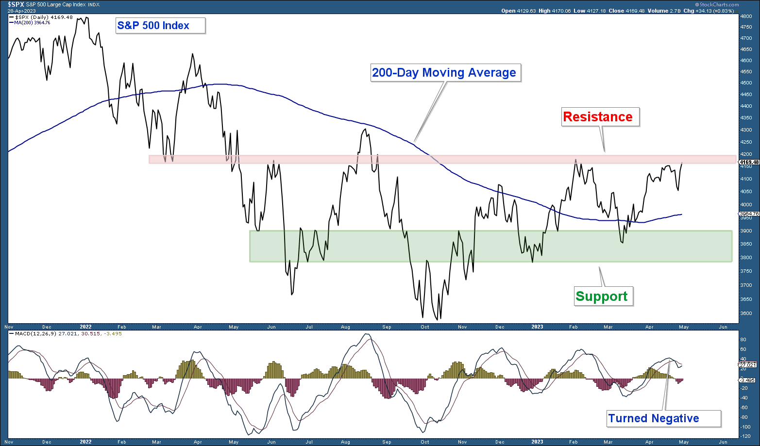
As long as the S&P 500 (chart below) is above its 200-day moving average the market is bullish from a price perspective. Here are my takeaways from the chart.
- The index is still above its 200-day moving average.
- The index is still in a structural uptrend.
- The index is sitting right under resistance and momentum has turned negative.
It would be bullish for the broader stock market if the index can advance decisively above resistance.
Conclusion:
- From a pure price perspective the stock market is bullish.
Technology Sector
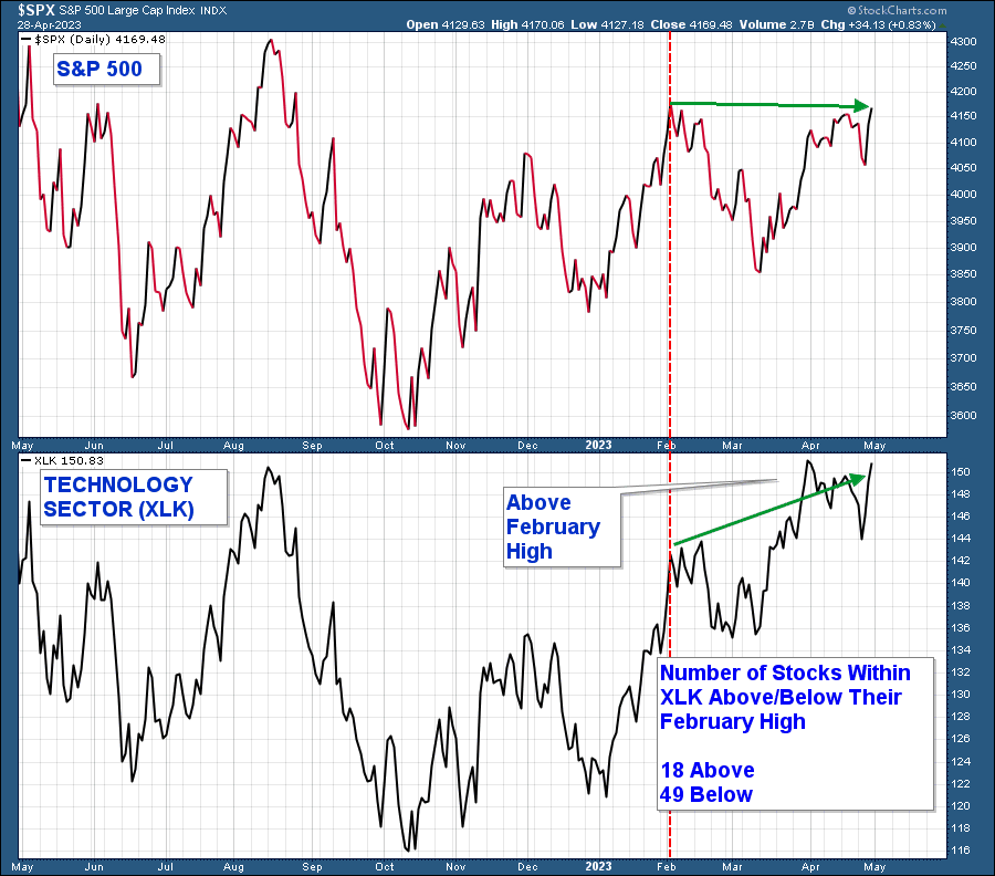
Last month, I charted the major S&P 500 sectors and stated that most of them looked weak with the lone exception being technology. The technology sector fund (NYSE:XLK)) (charted below) is the most important sector in that it has the highest weighting in the index and is considered a risk-on group. Therefore, the sector showing strength is a bullish market signal.
Notice how the S&P 500 is sitting near its February high (red verticle line). Now look at the technology sector and you see that it has advanced well above its February high. At face value, this is a bullish signal but when you dig a little deeper we see that the sector is not as strong as it appears.
The sector is capitalization-weighted meaning the larger stocks within that sector have a larger weighting in calculating its performance. While the index is substantially above its February high there are only 18 stocks within that index of 67 stocks above their respective February highs.
Conclusion:
- The S&P 500 has been led by strong performance in its largest sector, technology. However, only 27% of the stocks within that sector are above their respective February highs. This is just one of many data points that are signaling poor market breadth.
Nasdaq 100 Index
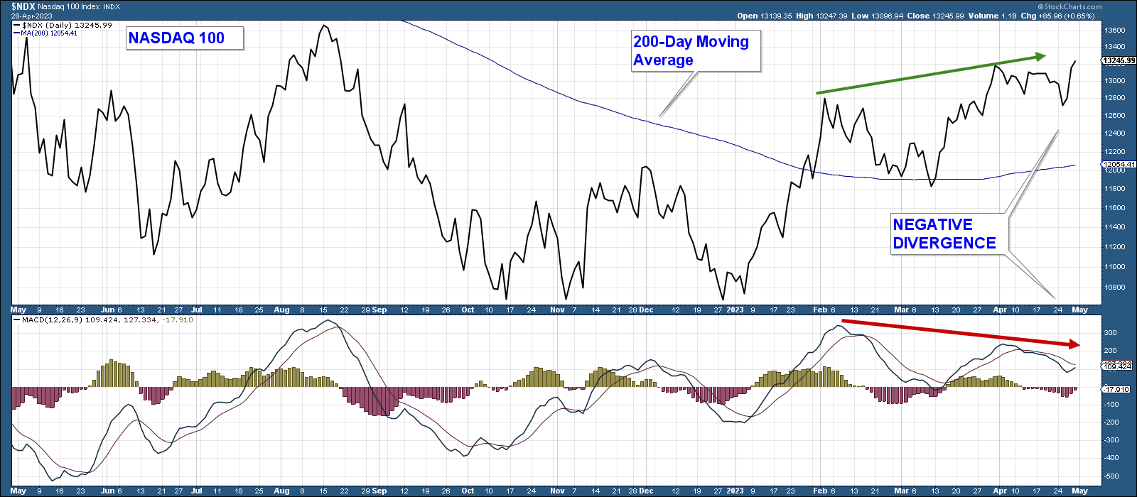
The Nasdaq 100 (chart below) has been leading the S&P 500 higher. Here are my takeaways from the chart.
- The index has advanced strongly above its February high displaying relative strength versus the S&P 500.
- The index is well above its 200-day moving average.
- The MACD (momentum indicator) has recently turned negative.
- The MACD is displaying negative divergence relative to the index.
Conclusion:
- While it is positive that the index advanced above its February high, the negative divergence in the MACD suggests that the advance is susceptible to a move lower in the near term.
Nasdaq 100 Equally Weighted
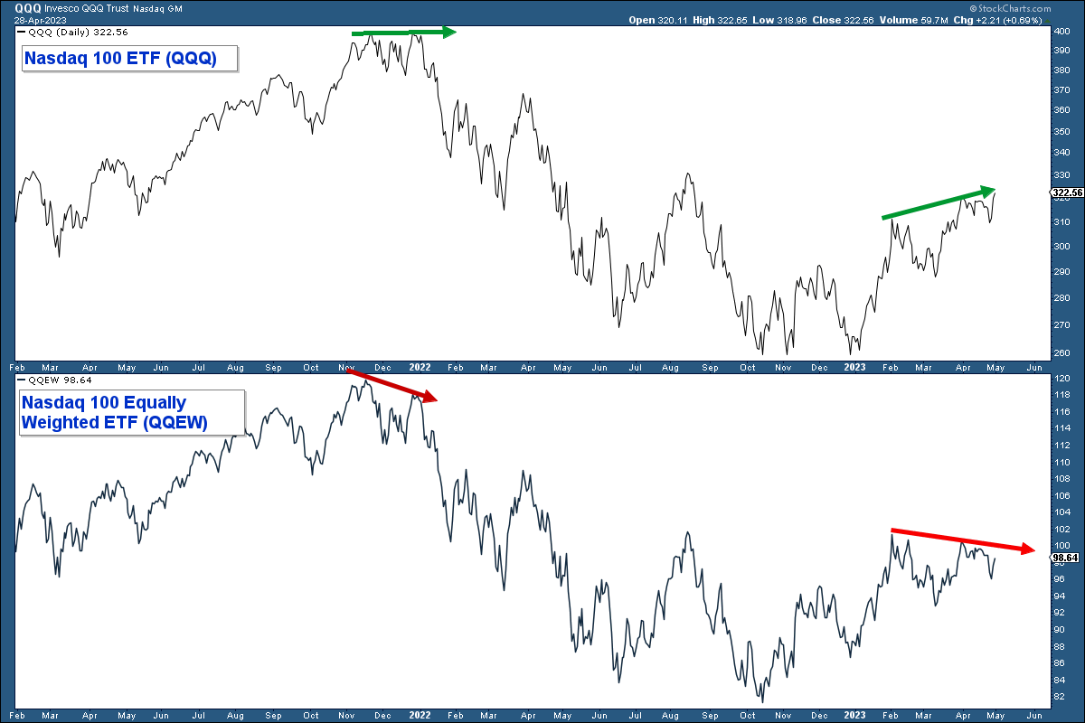
Below is a chart of the Nasdaq 100 ETF, Invesco QQQ Trust (NASDAQ:QQQ), in the upper panel and the Nasdaq 100 Equal-Weighted ETF (NASDAQ:QQEW), in the lower panel. Here are my takeaways.
The recent advance in the Nasdaq 100 is being made on weak breadth. The majority of stocks within that index are not above their respective February highs as seen by the equally weighted index diverging negatively with the Nasdaq 100 which is capitalization weighted.
Conclusion:
- The Nasdaq 100 Index is advancing on the backs of a handful of mega-cap stocks.
Long-Term Market Breadth
One of the reasons that I turned bullish at the beginning of this year was that the market transitioned to a decidedly risk-on environment and longer-term breadth indicators turned positive. This turned out to be a whipsaw or false signal given that strength reversed course later that quarter.
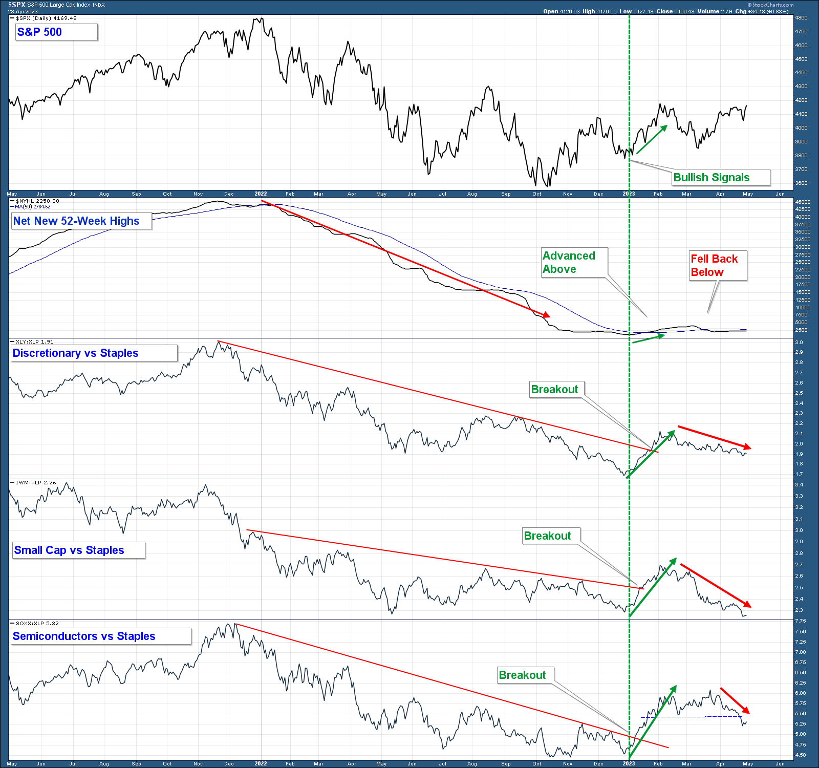
In the chart below are the S&P 500 Index in the upper panel, the Net New 52-Week Highs, and three relative strength charts. I have placed a verticle green line at the point in early January where the chart turned bullish.
Here are my takeaways:
- When the Net New 52-week Highs line is falling it indicates there are more stocks making new lows relative to highs and when it rises the reverse is true.
- When the risk-on sectors/industry groups charted below are underperforming the risk-off consumer staples sector (line falling) it signals a risk-off market environment which is a bearish broad market signal. When it rises it signals a bullish risk-on environment.
- Notice how all four charts below the Index were trending lower last year indicating poor long-term market breadth and a bearish risk-off environment.
- All four of those indicators turned strongly positive in early January (green verticle line) indicating a transition to positive market breadth and a more bullish risk-on environment.
- All four indicators reversed course and have fallen suggesting the strength that occurred in January has dissipated and we are back in a bearish market environment characterized by a deterioration in stocks making new highs and a risk-off market environment.
Conclusion:
- Long-term market breadth has turned negative and the bullish risk-on signal that occurred in January seems to be reversing course. This all signals a more risky market that is increasingly susceptible to a market correction.
Conclusion
As long as the S&P 500 continues to trade above its 200-day moving average market conditions are favorable from a price perspective. However, given that the majority of market internals have turned decidedly negative I don’t place a lot of confidence in the market’s ability to continue to trade above this average for an extended period of time unless internals somehow improve.
***
Disclaimer: Both our conservative and aggressive models are invested defensively. Our net equity exposure is minor and we own both long and short positions.
I will continue to adjust our net equity exposure based on the weight of the technical evidence.

