The S&P 500
The Federal Reserve has been increasing interest rates as a means to manage inflation by reducing overall demand in the economy. This strategy is intended to stabilize economic conditions. However, there is a concern that such actions might inadvertently lead to a recession. It is worth noting that historically, the stock market has experienced its most substantial declines during recessionary periods. The uncertainty surrounding the impact of these interest rate hikes has been acting as a deterrent to significant growth in the stock market. With the economic situation as a backdrop, let’s take a look at what market technicals are suggesting about the health of the stock market.
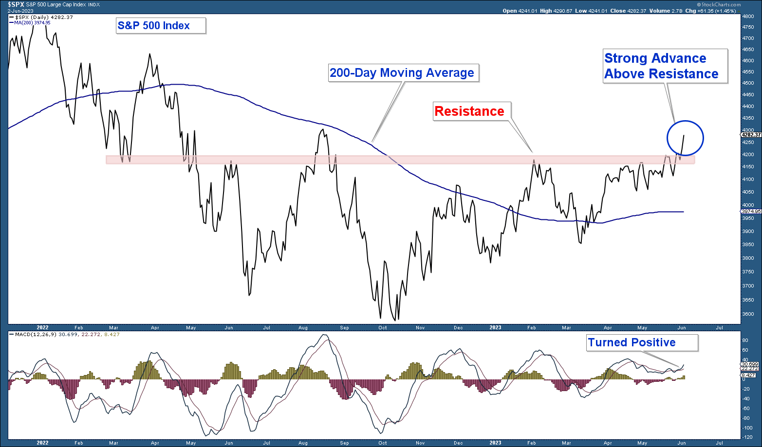
First, let’s look at a chart of the S&P 500 Index which is our market proxy.

Here are my takeaways from the chart:
- The index is still above its 200-day moving average.
- The index is still in a structural uptrend.
- The index has advanced strongly above an important area of resistance.
Conclusion: As long as the S&P 500 is above its 200-day moving average, the market is bullish from a price perspective.
Risk-On vs Risk-Off
A strong stock market is often characterized by a risk-on environment, which means that investors tend to favour stock categories that offer higher potential returns, even though they come with greater downside risks. The stock market displayed a bullish risk-on shift in January. However, this sentiment diminished in the months that followed. Recently, we have witnessed a resurgence of risk-on bullishness, coinciding with the S&P 500 breaking through a significant resistance level.
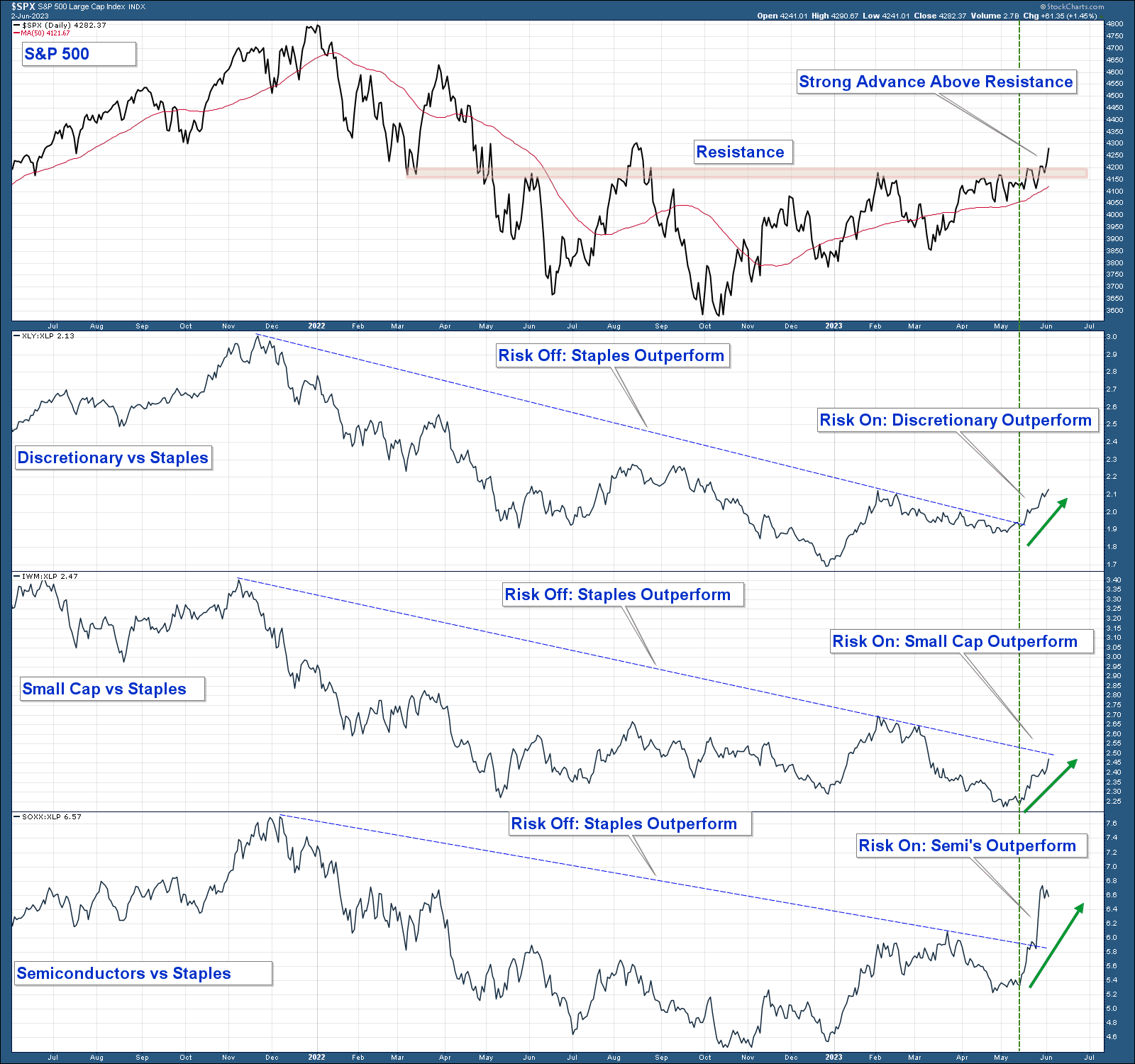
In the chart below, I have plotted the relative strength of three risk-on funds in comparison to the Consumer Staples Select Sector SPDR® Fund (NYSE:XLP). 
Here are the key takeaways from the chart:
- When the risk-on group is outperforming the line is rising and when it is falling it indicates that the risk-off Consumer Staples sector is outperforming.
- All three risk-on indexes underperformed last year which was indicative of a weak stock market.
- All three risk-on indexes began to strongly outperform in January; however, that outperformance reversed course in the months that followed.
- More recently (at the green vertical line), all three risk-on funds have exhibited strong outperformance prior to the S&P 500 surpassing a major resistance level.
Conclusion: The fact that risk-on assets are outperforming as the stock market advances above resistance is a bullish sign. It suggests that market participants are embracing higher-risk investments, indicating a positive outlook for the stock market.
The Fly In The Ointment
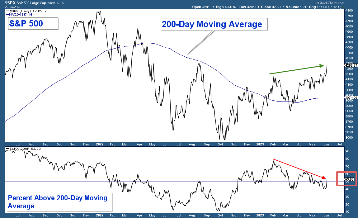
While the technical indicators mentioned above suggest a positive market outlook, there is a notable concern that hinders a more bullish sentiment: poor market breadth. Despite the advancement of major market indexes, this progress is primarily driven by a small group of mega-cap stocks, while the majority of stocks within those indexes are not participating in the upward movement. To illustrate this point, I have included a chart below. The upper panel represents the S&P 500 Index, while the lower panel shows the percentage of stocks within that index that are trading above their respective 200-day moving averages. 
Here are the key observations from the chart:
- In January, there was a significant increase in the percentage of stocks above their 200-day moving averages, aligning with other positive technical signals. However, this strength was short-lived and has been declining since early February.
- While the S&P 500 Index has surpassed its February peak (green arrow), the percentage of stocks within that index above their respective 200-day moving averages has been declining (red arrow) and is well below its January peak.
- Despite the index being comfortably above its 200-day moving average, only 57% of the stocks within that index (red rectangle) are trading above their respective moving averages.
Conclusion: The market continues to face the challenge of poor market breadth, where the majority of stocks are not participating in the market’s upward movement. This is an important factor to consider when evaluating the overall market condition.
Conclusion
The current market environment is characterized by partial advancement rather than a uniform upward, positive trend in market technicals. Let’s summarize both the bullish and bearish aspects to gain a comprehensive understanding.
On the bullish side, major indexes are displaying structural uptrends, indicating overall positive market conditions. Additionally, the S&P 500 is trading above its 200-day moving average, suggesting sustained price strength. Furthermore, risk-on segments of the market have recently started to outperform again, signalling increased investor confidence in higher-risk investments. However, it is essential to acknowledge the bearish factors as well. There is a significant risk of a major recession, and if this risk materializes, it would lead to substantial declines in stock market prices, probably surpassing the 2022 October lows.
Additionally, market breadth, which measures the participation of individual stocks in the market’s performance, is currently poor. This implies that the market’s overall strength is driven by a limited number of stocks, while the majority are not sharing in the upward movement.
***
Disclaimer: Both our conservative and aggressive models are invested defensively. Our net equity exposure is minor and we own both long and short positions.
I will continue to adjust our net equity exposure based on the weight of the technical evidence.
